
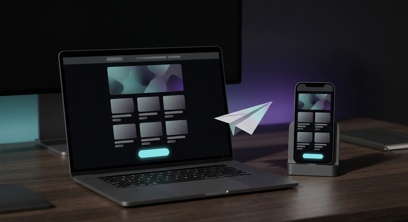
A newsletter that gets clicks follows a predictable shape: a preheader and header that earn the open, a hero that sets the topic, a product or content grid that does the actual selling, one clear call to action, and a footer that keeps you compliant. Miss a block or bury the grid under too much copy, and clicks drop even if the subject line was good. Here's the structure, block by block, and how to build it in the tools a Shopify store actually uses.
What makes a good email newsletter design?
Good newsletter design is not about looking impressive. It's about getting a reader from "I opened this" to "I clicked something" in under ten seconds of scrolling. That means a clear visual hierarchy (one obvious place to look first), real text instead of text baked into images (so it loads fast and reads to screen readers), and enough white space that the product or offer you care about isn't competing with five other things for attention.
The two generic habits that kill this: cramming in every promotion you're running this week, and defaulting to a wall of brand storytelling before you show anything clickable. Pick one goal per send.
How should you structure a Shopify newsletter, block by block?
This is the order that works, and the one block most "newsletter inspiration" roundups skip over because they're built around editorial brands, not product sales:
- Preheader: the line next to or below your subject line in the inbox. Treat it as a second subject line, not a repeat of the first sentence of your email.
- Header: logo and, optionally, a one-line nav (shop, sale, help). Keep it short; this isn't your website header.
- Hero: one image and one headline that state the topic of the email in half a second (new drop, sale, restock).
- Short intro copy: two or three sentences, max. This is context, not the sales pitch.
- Product or content grid: the block that actually earns clicks. For a promotional send, three to six products with image, name, price, and a link straight to the product page. This is the block most generic newsletter guides never discuss, because they're written for media newsletters, not stores.
- One clear call to action: a single button with action language ("Shop the sale," not "Learn more"). If your grid already links every product, this CTA points at the collection or sale page, not a duplicate of a product link.
- Supporting content: optional, a secondary promo, a review, a restock note. Keep it visually smaller than the grid above it.
- Social links: small, at the bottom, not competing with the CTA.
- Footer: your unsubscribe link (legally required), mailing address, and contact info.
Keep the whole thing in a single column around 600 pixels wide. That width survives every major email client's rendering quirks without needing a separate mobile layout, and body copy should stay at 14px or larger so it's still readable at a glance on a phone.
How do you build this in Klaviyo or Shopify Messaging?
Both tools map onto this structure directly, which is the part the generic design roundups never get into because they're not written for either platform.
In Klaviyo's drag-and-drop email editor, you build with text blocks, image blocks, and table blocks. The table block is the one that matters here: it can display an image and text side by side, and it can be set to dynamic so it iterates over your product feed automatically, which is exactly what the product grid block needs. Group your hero, intro, and grid into sections so you can reuse the same structure as a saved template for next week's send, swapping only the products and copy. Klaviyo's own template library versus an AI tool that builds the whole thing from your store data is worth comparing if you're deciding how much of this to build by hand.
In Shopify Messaging (the email and SMS tool inside Shopify's admin, under Apps > Messaging), you start from a default template or build your own branded one, and it pulls your store's colors, logo, and live product data into the blocks automatically. You pick the segment that receives the email and can go deeper with Liquid if you need custom logic, but for a standard weekly promotional newsletter the default product-block layout already follows the structure above.
Either way, build the template once, save it, and reuse it. The newsletters that look inconsistent week to week are almost always ones someone rebuilt from a blank canvas each time instead of a saved base.
What newsletter design mistakes actually kill clicks?
- Text-heavy hero, grid buried below the fold. If someone has to scroll past three paragraphs before seeing a product, most won't.
- No single CTA. Five buttons pointing at five different places means the reader has to decide, and most won't bother.
- Text baked into images. Besides failing accessibility contrast checks, image-only text doesn't render at all for the subset of inboxes that block images by default, so the email reads as blank.
- Low-contrast text on brand-colored backgrounds. Brand color on brand color often looks sharp on a designer's monitor and fails outright on a dim phone screen. Web accessibility guidelines (WCAG 2.1 AA) set a minimum contrast ratio of 4.5:1 for normal body text and 3:1 for large text, which is a reasonable floor even if you don't have a formal accessibility requirement.
- Tiny tap targets. A product image or button under about 44x44 pixels, the minimum Apple's own interface guidelines have specified since the first iPhone, is genuinely hard to tap accurately on a phone, which is where most newsletters get opened first.
How often should you redesign your newsletter template?
Less often than you'd think. Redesign when your brand visuals change, when your product photography style changes, or when you notice a specific block underperforming (track clicks per block, not just overall CTR, if your platform supports it). Otherwise, reuse the same saved template and just swap products and copy. Consistency is part of what makes a newsletter feel like it's actually from your brand, and rebuilding from scratch every week is exactly where the mistakes above creep back in.
If building a clean, on-brand version of this structure every week is the part that eats your time, that's the actual bottleneck for most one-person marketing teams, not the structure itself. What that time costs if you hire it out instead is worth knowing before you decide how to spend it. JetFlow builds this structure from your store's real products and branding and pushes the finished email into Klaviyo, so the weekly rebuild isn't manual.