
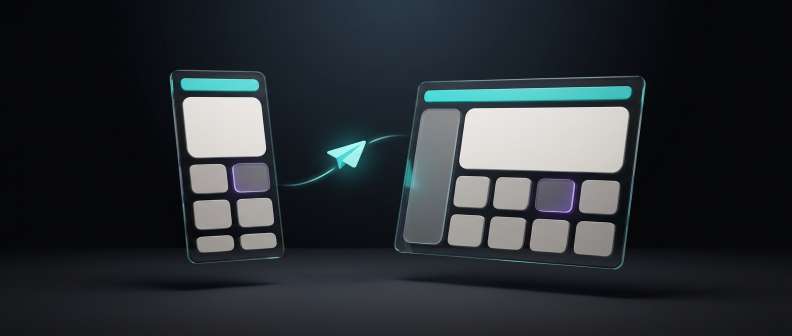
Most "responsive email design" advice is still written for an inbox that doesn't exist anymore. It assumes Outlook is your biggest problem and mobile is an afterthought. Neither is true in 2026. Apple's mail clients, iPhone and Mail combined, now render more than three out of every four email opens. Outlook desktop is down to a rounding error. And Microsoft has already started retiring the rendering engine that caused most of the hacks your templates probably still carry. Here's what to actually design and test for right now, and what from the old playbook still holds.
What does "responsive" mean for an email, not a website?
On a website, responsive design means fluid grids, flexible images, and CSS media queries doing real work, often with Flexbox or CSS Grid. Email doesn't get that luxury. Most email clients render HTML with their own stripped-down engine, not a browser engine, so the layout tools that are reliable everywhere are narrower: tables for structure, inline CSS for styling, a single fluid or "hybrid" column that collapses cleanly on a small screen, and media queries treated as a bonus for clients that honor them, not a requirement the layout depends on.
That's why every serious email template still looks simple compared to a modern webpage. It's not a design limitation, it's the actual constraint of the medium.
Does Outlook still break your emails?
Less than it used to, and it's about to matter even less. For nearly two decades, Outlook desktop (Windows) has rendered HTML emails using Microsoft Word's engine rather than a real browser engine. Word ignores CSS Grid and Flexbox entirely, ignores :hover and other pseudo-classes, and needs a VML workaround just to show a background image. That single engine is the reason "bulletproof" email coding, table-based layouts, and avoiding modern CSS became standard practice.
Two things have changed. First, per Litmus's own current market share tracking (based on over 1.5 billion tracked opens, as of September 2026), Outlook desktop clients account for about 3.48% of all opens, down from a far larger share years ago, while Apple's mail clients alone (Mail, iPhone, iPad) account for 76.56% and Gmail for 16.10%. Second, Microsoft is actively moving people off the Word engine: the new Outlook for Windows, built on a Chromium-based web engine that supports Flexbox, media queries, background images, and web fonts, began its "opt-out" phase in April 2026, meaning it's now the default experience for most Windows users, who can still switch back to classic Outlook if they need to. Microsoft hasn't announced a hard cutover date for home users, and says it will keep supporting classic Outlook for many Microsoft 365 and perpetual-license customers through at least 2029, so the old engine isn't gone. But it's no longer the client you should be designing defensively around first.
Which email clients actually matter for a Shopify store?
Design and test for these, roughly in this order of how often you'll see them in your own Klaviyo or Shopify Messaging analytics:
- Apple Mail / iPhone Mail. The overwhelming majority of opens. Supports modern CSS well, including dark mode, so this is where your design should look its best, not just "not broken."
- Gmail (app and web). Second-largest by a wide margin. Historically strips
<style>blocks in some contexts, so inline styles still matter here even though Gmail's rendering has improved a lot. - New Outlook for Windows (Chromium) and Outlook.com. Now the default for most Windows users. Renders close to a modern browser.
- Classic Outlook desktop (Word engine). Shrinking, but some of your business and B2B-adjacent subscribers will still open here. Keep your layout simple enough that it doesn't collapse in this engine, without redesigning the whole email around it.
If you have real subscriber data, check it. Klaviyo's analytics can show opens by device type, and that's a better guide than any industry-wide average for your specific list.
Do you still need the single-column, 600px rules?
Yes. That part of the old advice hasn't changed, and a block-by-block structure built around it still earns more clicks than a clever layout does. Klaviyo's own template editor recommends a 600px content width for exactly this reason: nearly every client, old and new, renders a single column at that width correctly without needing a media query to rescue it on a small screen. What's changed is why you're keeping it. It's no longer purely a defensive move against one bad engine. A narrow single column is also just easier to scan on the device most of your opens happen on now, which is a phone screen, regardless of which client renders it.
What about dark mode and accessibility?
Apple Mail and other modern clients will re-render your email in dark mode if your subscriber has it turned on, sometimes inverting colors you didn't design for. A transparent PNG logo with dark text can disappear. The safer fix is a logo with a subtle background color baked in, rather than relying on transparency, and testing your email with dark mode on at least once before a big send.
Accessibility matters here too, and it's easy to fail quietly. WCAG 2.1 AA requires a contrast ratio of at least 4.5:1 between text and its background for normal-size text, or 3:1 for large text (18px and up, or 14px bold). Plenty of "on-brand" templates use light gray body text on a white or pastel background that looks fine to the designer and fails that ratio outright. Check your actual hex values against it, not just how the email looks on your own monitor.
How do you test an email before you send it?
Use what you already have before reaching for a third-party tool:
- Klaviyo's built-in preview. Toggle between desktop and mobile views in the template editor, and preview with a real subscriber profile so personalization fields show real data instead of placeholder text.
- A real test send. Send the actual email to your own inbox and at least one teammate's, on a different email client than you use yourself, before every campaign. This is the single step most missed sends trace back to skipping.
- Klaviyo's inbox testing (paid plans). Built in partnership with Mailgun, this renders your email across real devices and clients and generates a shareable preview link valid for 7 days, so anyone reviewing it doesn't need Klaviyo access. Worth using on anything image-heavy or unusually designed, not just your routine campaigns.
- Litmus or Email on Acid. Third-party tools that go further if you need client-by-client screenshots Klaviyo's own testing doesn't cover, typically worth it once your email program is big enough that a rendering bug is expensive.
A quick pre-send checklist that catches most of what actually breaks:
- Content column around 600px, single column.
- Body text 14px or larger, contrast checked against your actual background color.
- Images have alt text and won't break the layout if they fail to load.
- Buttons and tappable product images are large enough to hit on a phone screen, not just visible.
- Tested with dark mode on, not just light mode.
- Sent a real test to at least two inboxes on different clients before the campaign goes out.
Get this right once, and it stays right. The templates in Klaviyo's own editor and in JetFlow-generated emails both default to the single-column, 600px structure for this reason, so you're not starting from zero either way. What's worth your own attention is the testing step, since that's the part no template picks for you.